
Photography Specifications
DIGITAL CAMERA
Use a 5 Megapixel Camera or Better
You may submit your digital images (either scanned or from a digital camera). The following offers guidelines to help you submit a high quality image that is suitable for
4-color printing at the Iris Group.
If you are using a digital camera, the image quality is determined by the quality of your camera. A good indicator is MegaPixel. Check your owner’s manual or the camera itself for details. We recommend that your camera be at least 4.8 MegaPixels for a good full-bleed image on our Deluxe 6 x 8.5 size postcard. A 5.24 MegaPixel camera is excellent for professional printing of a full bleed 8.5 x 22 brochure.
Set your digital camera to the highest possible quality setting. Beware of settings that read “Quick,” “Low” or “Email.” These will not result in good quality images. You should also be aware that your camera takes pictures in RGB color format, but your image will print in CMYK (see below). Because of this difference in color space and gamut (range of colors), the image you see on your camera display or computer monitor may not match our 4-color press. For a more accurate on-screen color representation of your file, please download and install our Photoshop Color Settings (below).
File Type:
We accept TIFF images as well as JPEG, however, make sure your image meets these specifications before sending it in:
Resolution:
We require all digital images to be between 300-355 dpi (dots per inch) and be set at 100%. The quality setting of a JPEG must be set at “high,” “fine” or “maximum.”
Let’s say you have an image that is 100 dpi. What if you just change your 100 dpi image in Photoshop to 355 dpi by changing the number? When you “change the number” from a low resolution to 355 dpi, you are not really addressing the underlying problem. Doing this is called interpolation. Interpolation means that you are asking the computer to calculate the pixels that are not there. Computers cannot add new data to sharpen the image, it can only add pixels that “fill the gaps.” What you end up with is a tiff that is at 355 dpi, but very, very blurry.
Digital file resolutions and printing resolutions are not the same. A digital file’s resolution is determined by pixels per inch (ppi). A print’s resolution is measured by dots per inch (dpi). Higher resolutions usually translate to better quality, but also tend to increase the size (MegaBytes) of a file and the time it takes to output.
For example, a 4 inch by 4 inch CMYK file, at a digital resolution of 72 ppi (.324 MBs in size), and output at a printing resolution of 360 x 360 dpi may only take about 30 seconds to output. But the same CMYK file, at a digital resolution of 355 ppi (7.69 MBs in size), and output at a printing resolution of 2880 x 1440 dpi, might take as long as 5 minutes to output.
Size:
When sending us a digital image the physical dimensions must match the dimensions of the image in the brochure. In other words, if the image in the brochure is 8.5 x 11, then the digital image must be 8.5 x 11. This will be a very large file size. If your 8.5 x 11 digital image is not at least 40MB (megabytes), then the quality is not up to our specifications.
Although there are exceptions, we advise you not to send images you can e-mail or have copied from the web. These images are formatted for the Internet and do not always reproduce well in print. Ideally, for optimum results and a high quality brochure, you should send us professionally photographed transparencies. With our state-of-the-art drum scanning equipment, you’ll get a terrific reproduction of your image. If digital is your choice, please follow all of our recommendations.
Color:
There are two main categories of color in images: CMYK and RGB.
CMYK stands for the four colors used on a 4-color press: Cyan, Magenta, Yellow, and Black. These colors are reflective colors in that the inks reflect light into your eyes so that you see color. One plate is generated for each color for a total of 4 plates.
RGB, on the other hand, is the primary color mode used for monitors and televisions: Red, Green, and Blue. These colors make up visible light.
There is usually a color shift involved if you have to convert from RGB to CMYK. The colors that make up visible light do not directly correspond to the colors that make up a 4-color press. If you are concerned about how the color will print, we recommend you order a Color Proof. This will give you a good idea of how close you are going to get to the color on our press without actually printing the cards.
Adobe Photoshop Color Settings:
The following information is designed to assist you in predicting how your digital images will print at the Iris Group. Our goal is for your monitor to look similar to ours. Because of the different operating systems and versions of Adobe Photoshop, we have prepared solutions for most, but perhaps not all, situations.
Monitor calibration and printing profiles:
Monitor Calibration
The main purpose of calibrating is to set white and black points, contrast, brightness, and gamma (midtone density).
Since monitors differ from one to the next (even same brand and models), no two will respond in exactly the same way. The older your monitor is, the more likely it will lessen in both brightness and clarity. For color critical work, most monitors are dependable up to only two years. Some are better. Some are worse. You will have to be the judge. Calibrating your monitor is very important for color critical work. Do this a minimum of once a week. Even high-end soft proof workstations require frequent recalibrations.
You will need software to calibrate your monitor. Adobe Gamma (supplied with the Windows version of Photoshop) and Monitor Calibrator (Mac OS only) are simple to use. Both programs have “wizards” that can guide you, step by step, through the process. There are also a variety of more sophisticated software that can be purchased from third party developers, as well as high-end software that is included with the purchase of a monitor that is specifically designed for color critical applications.
LCD Monitors
Image files displayed on LCDs typically print darker than they appear on screen due to screen brightness. For this reason, LCDs are not recommended for preparing print ready image files (although new technologies will eventually change that). Sometimes, LCDs can be adjusted within acceptable tolerances.
Color Profiles
f you are new to The Iris Group and would like to make sure your digital images print similar to what is displayed on your monitor, it is necessary to, calibrate your monitor, and also use our printing profiles.
Or send us a color sample that is similar to your expectations. We will compare your digital image file to it. If they are not alike, we can color edit your file to better resemble your color sample.
Download our latest Printing Profiles (Mac and PC). When you print with us again, please be sure to check for the most recent printing profiles, to achieve the best possible results.(Updated July 2021):
Placement of our Press Profiles
(We update our press profiles 2 or so times a year. Be sure to download our most recent press profiles before submitting your next job.)
Profiles define the color space of a device. In this case, that device is Modern Postcard’s printing press. The color space referred to is the inks (cyan, magenta, yellow, and black) used on The Iris Group’s press. The profiles are placed into your computer and used by Adobe Photoshop (and other icc-compliant applications). Such applications can utilize our press profiles as additional choices amongst several already existing on your computer. Place the profiles (icm’s) into the appropriate folder on your computer, and read the next two documents about “Assigning Profiles” and “Converting to Profiles.”
Mac OS Profiles are located in one of two locations:
– Mac HD/Library/ColorSync/Profiles
– Mac HD/Users/
In Windows, profiles are located here:
– C:\Windows\System32\spool\drivers\color
If accurate color is critical, please request a Color Proof ($35).
Additional Info on How to Use:
Assigning Profiles
Assigning a profile is nothing more than viewing an image file as it would appear on another device. Color values within the image file will not change, but it’s appearance will.
For example, if you are viewing an image file that has the embedded profile of SWOP (U.S. Web Coated (SWOP) v2) and assign it Modern Postcard’s profile (MP_Front_Color), you would notice certain colors shifting. Fleshtones would probably become more orange, blues more purple, and some other things would also change in appearance*.
(Go to Image/Mode/Assign Profile…)
Now you’ll know how your image file would have printed if you didn’t first convert it to the press profile of your printer. But you’ll want to convert your image file first. Read the next section on “Converting to Profiles.”
*You can only assign profiles that are from the same color space as the image file. In this case, that color space is CMYK, a printing color space. Many Photoshop users prepare their CMYK image files in Photoshop’s default CMYK color space, SWOP, as used in this example. Therefore, converting from SWOP to your printer’s press profile usually renders good results. If converting from RGB, go directly to your printer’s press profile.
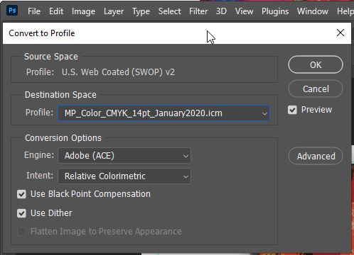
Converting to Profiles
Converting to a press profile is a necessary step in preparing your image file to print at any printer. If you don’t, you will not get from your printer what you see on your monitor*.
(Go to Image/Mode/Convert to Profile)
This will not cause your image file to shift in appearance much if any. If you check, you’ll notice that the CMYK values have been changed, and now your image file is prepared to print at another printer.
Good to Know
These settings are not permanent. You can toggle amongst several such settings. If you print elsewhere, simply obtain their profiles and load them. Similarly, you can change your color settings on the fly for web specific purposes, multimedia, 4-color press, etc. — using the most appropriate setting for each project. Color management tools for your projects are good to know.
FILM & CAMERA
Use Ektachrome Film Only
Type: Kodak Ektachrome Transparency Film
Sizes: 120
Designations: EPP, EPY or EPR
Asa: 64 or 100
Processing: E6
 Film
Film
We prefer 120 roll film. However, 35mm and 4×5 formats are acceptable. Let us know if you want your images cropped.
Shoot Full Frame Only
You should use minimal cropping to fit format windows. Remember camera formats such as 35mm & 6×6 are not proportional to our window formats. If there is something in the frame that you do not want to appear, change the camera position or make other adjustments.
Bracketing of Exposures – IMPORTANT!! – In order to ensure that you have the correct exposure, bracket your shot several times. Submit 5 exposures in 1/2 stop increments so you have a full stop overexposed, the correct exposure and a full stop underexposed. Let us determine the correct exposure for printing. We understand the limitations of bracketing with 4×5, so start with a polaroid to find correct exposure and then bracket 1/2 stop up and 1/2 stop down if possible.
Strobe All Interiors
Do not use available light. All interiors should be strobed with at least four heads located throughout the room to evenly light the space. If you do not properly light a room, your results will be unpredictable.
Lighting & Color Balance
Film records a scene differently than our eyes see it. Make sure you understand how to achieve natural looking results. Transparency materials may be harder to work with but they yield much better color and sharpness than can be achieved with print materials.
Lenses
A wide angle lens is used about 90% of the time. Normal & telephoto lenses tend to flatten out the subject and make it look two dimensional although the selection of lenses will be determined accordingly by you.
Use a Tripod
Soft or double images due to camera shake are unacceptable. Please make sure your camera is firmly mounted on a stable tripod.
Transparency Viewing Conditions (5000K lightsource) – Viewing conditions will greatly alter your perception of a transparency. You & your client must view transparencies with a standard 5000K viewing box to get an accurate representation of what the transparency and color look like when printed. Do not hold transparency towards outside windows, fluorescent lights, light bulbs, etc. This will actually alter image color & saturation.
 Additional Items
The Iris Group, Inc. does not provide lab services. However, we realize that sometimes the client wishes to use existing photography or may have a rendering of the property. Listed below are the requirements needed to produce a quality image from a rendering, duplicate transparencies or negatives. It is imperative to have the client review and approve the film from the lab; understand that we are going to use the transparency as our original guide to match color, NOT THE ORIGINAL ARTWORK.
Renderings
For rendering transparencies, a 4×5 transparency is needed and must be shot with a color bar. Make sure client understands we will match color as close as possible to the transparency, not the rendering.
Duplicate transparencies – when submitting a duplicate transparency, you must indicate positioning by providing:
- A print from the same transparency
- A written description indicating proper positioning
- Client needs to have a clear understanding that we will match color to the duplicate and not the original.
Negatives
We do not accept negatives. However, in the event that your client wants to use that image, have your lab make a transparency directly from the negative. It is very important to check the accuracy of color. As a proof, have a print made from the negative and compare the two (print & transparency). Once again, client must remember that we will be matching color from the transparency, not the negative.
Prints
Not recommended. However, if a print is all that is available, submit no larger than 8×10.